
How Visualizing Inferential Uncertainty Can Mislead Readers About Treatment Effects in Scientific Results
Jake M. Hofman, Daniel G. Goldstein, Jessica Hullman
ACM Human Factors in Computing Systems (CHI) 2020 | ![]() BEST PAPER HONORABLE MENTION
BEST PAPER HONORABLE MENTION
Examples of stimuli used in Experiment 1 and Experiment 2. Shown are disaggregated data with mean (left) and mean aggregated data (right) for Experiment 1 (n=1000, left column) and Experiment 2 (n=50, right column). Disaggregated data stimuli simply have the mean mark in red removed for each chart. Each row depicts the data-type combination: univariate (top), one quantitative and one categorical attribute (middle), and two quantitative attributes (bottom).
Abstract
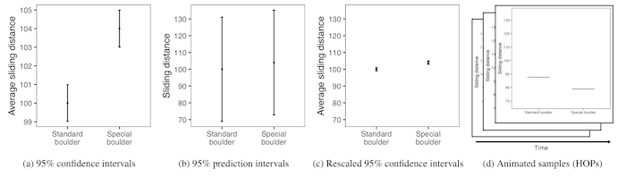
When presenting visualizations of experimental results, scientists often choose to display either inferential uncertainty (e.g., uncertainty in the estimate of a population mean) or outcome uncertainty (e.g., variation of outcomes around that mean) about their estimates. How does this choice impact readers’ beliefs about the size of treatment effects? We investigate this question in two experiments comparing 95% confidence intervals (means and standard errors) to 95% prediction intervals (means and standard deviations). The first experiment finds that participants are willing to pay more for and overestimate the effect of a treatment when shown confidence intervals relative to prediction intervals. The second experiment evaluates how alternative visualizations compare to standard visualizations for different effect sizes. We find that axis rescaling reduces error, but not as well as prediction intervals or animated hypothetical outcome plots (HOPs), and that depicting inferential uncertainty causes participants to underestimate variability in individual outcomes.